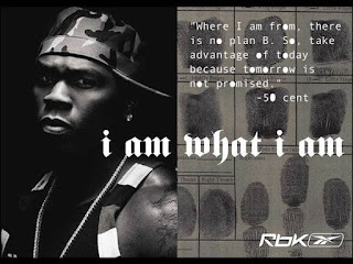
In this poster, the black and white colour scheme creates a mood within the central image which shows the central image to be a serious person. Furthermore, there are more colour black than white suggesting how independent and strong 50 Cent is. In addition, the colours also make 50 Cent look Urban. Additionally, using a black and white colour scheme forces the viewer to understand the personality or the behaviour of 50 Cent.
The shot is a close up medium shot showing the serious facial expression of 50 Cent. Moreover, 50 Cent is directly looking at the camera showing his dominance and lack of hesitance which is also showing his seriousness. Lastly, 50 Cent's body is not fully facing forwards towards the camera suggesting how 50 Cent has more capability of danger than before.
The font that is used in the poster is a urban type of font signifying the absolute and extreme danger of 50 Cent. Moreover, the title is more of a imperative sentence suggesting his lack of fear of anyone.
The central image (50 Cent) covers up mainly all of one side of the poster showing his significance in dominance.
Batman vs Superman
In this movie print advert, it shows Batman and Superman one on one with each other rather looking furious and strong. The colour scheme i would say that its quite a black and white colour as it fades from white from the top to black down to the bottom. This signifies how peace has been taken over by destruction so quickly by the two superheroes. Furthermore, the colour scheme reflects the mood of the characters showing how the characters are now extremely agitated and belligerent. The red logo of the bat and superman's indicates two warriors going at war against each other which then will cause a lot of brutality and blood as the colour of the logo is red.
Additionally, it also shows the atmosphere to be intense as we can see the two great superheroes go one on one with each other for the first time.
Batman and Superman are positioned in the middle of the print advert to show their significance and their relevance as the movie is mainly about them two. Also the fact that there needs to be an eye catching central image in a print advert.
In comparison to the whole print advert, the two central image are a perfect size in my opinion as it can show more details of how masculine they look perhaps. Or what suit they are wearing.
This angle shot is quite of a wide establishing shot as we can see the huge buildings in destruction maybe because of the intense fight between the two greatest and strong people. The wide shot helps us to see the setting of the fight. The setting of the fight looks to be in a town due to the huge buildings. Moreover, its quite of a low angle shot on Batman which could show that Batman dominates Superman in the movie.
The subject of the print advert are Batman and Superman as we can both see them looking at each other furiously. Firstly, i can state that Superman looks to be the weaker one as it looks like that he is looking up to look at Batman showing Batman's dominance. On the hand, Batman looks to be the stronger one as he is the one that is standing up straight fearlessly. He also looks more masculine because of his metal made suit.
The lighting helps me to state that both of the central image look very dominant. But however, there is more light on Batman's back than on Superman and this signifies how Batman is the victorious one perhaps. However, also could show how Superman is more lethal as he is shown to be darker as less lighting is on him. Additionally, Batman is dressed in all black and black is a colour that shows danger and masculinity. This perhaps also suggests how he is more deadlier than Superman. Lastly, Batman is facing the other way from the camera maybe suggesting how he is mysterious and stealthy when it comes to knowing when to attack. This maybe is suggesting how smart can take over real super power because Batman is just a mortal human being with no super powers but Superman is a god like character who has the power to fly and is man of steel.


WWW- You have thought about the angle and the type of shot you have looked at as well as the light but it would be helpful to have put them into categories / headings such as composition / camera shot / lighting and use some of the MEST2 work you have done on low and high key lighting to think about how this shot is framed and lit.
ReplyDeleteYou have thought about connotations well but you now need to think about analysis and how texts appeal to specific target audiences - demographic and psycho-graphics. Also cannot see your oppositional / preferred and negotiated readings (Stuart Hall)?
Use more media terminology such as mise-en-scene and then bold this so you can keep track of your progress.